becoming the DesignOps – a bridge between design and development with rebranding

intro
What makes a design system special and real: the understanding that it is a shared language between designers and developers. Once this foundation is built between the two teams, everything else falls into place (I promise, this wasn’t written by AI).
duration – 1 week
role – lead designer
deliverables – design library, design tokens, component guidelines
——
the backstory
However, during our rebranding to sccc by stc – following stc guidelines – it was clear to me that we needed a system that connects with our new branding guidelines and design needs. Fast forward to our sccc design system – built and lead by yours truly ⭐️
Although – I cannot ignore the help provided by our AI friend – chatGPT – in providing a structure and checklist of the foundational components mentioned above, I used that list to guide me through the process.
–agreed on points
color system: brand colors + tailwind
4px grid system
token naming and usage – naming needed to make sense to both developers and designers.
–major challenges we faced
deciding on the mostly used and high priority components and limiting them to 5-8 components.
balance between building from scratch and using some of buy-in components (if it works well, why invent something new?)
deliver clear guidelines for both designers and developers (a common language for all)
make use of the right AI tools at the right time, instead of wasting time trying multiple ones.
——
dive into the real deal / thing

We started with the basics: color, spacing, typography, and tokens.
The goal wasn't just to make things look consistent — it was to create a foundation that developers could actually work with, and reduce friction between the design team and them.
01 Token naming & figma to code
One of the trickier parts was token naming. It needed to make sense from both sides of the table, so a designer could understand what they were using while a developer could easily translate it into code.
However, I worked with the development team to ensure a common language is built between us.
After all, a design system isn't really a system if it only lives in Figma.
02 The component dilemma – build or borrow?
One of the dilemmas we were in was: do we build this from scratch or borrow it from our older design system?
We went with an approach that is a mix of both – If an existing component solves a problem well, then we will re-style and re-use it. This way allowed us to focus on which components that serve our products and users.
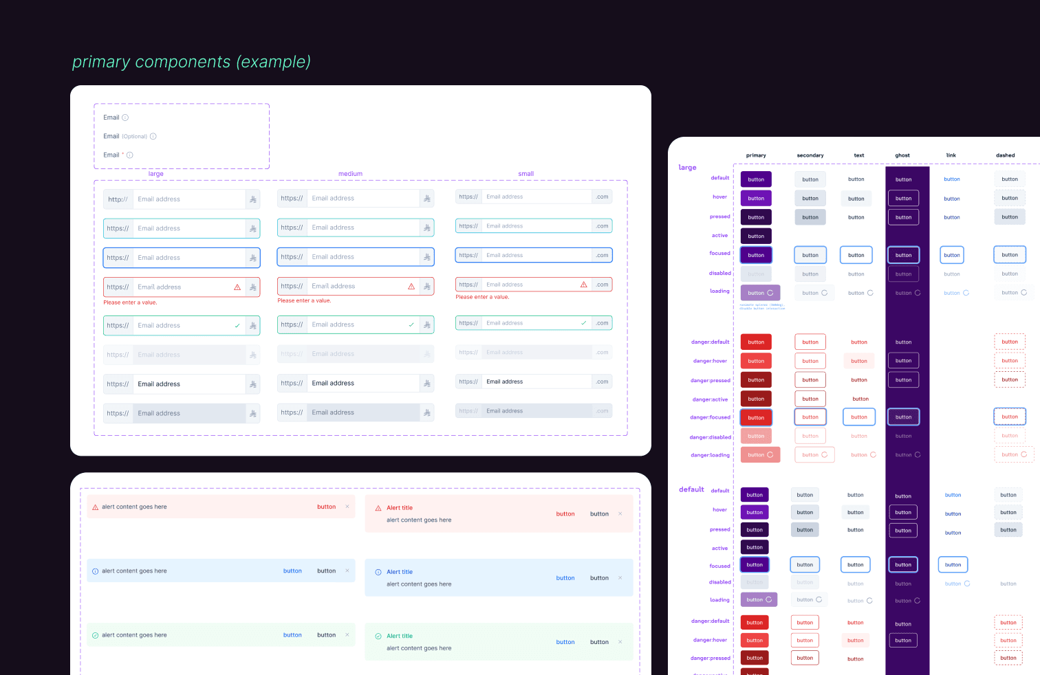
03 The guideline = our shared dictionary
We noticed int the previous design system major inconsistency with certain behavior. For example, do we validate form values upon clicking 'Submit' or when the user stops typing?
In order to avoid such minor discussions during a product sprint, we agreed on building default behaviors – with the flexility on changing based on specific cases in the future.
The result?
The guidelines became our shared reference point — documenting not only what a component looks like, but when and how it should be used.
Design team member don't have to guess or refer back to me to question how a certain component behaves
——
The end of the beginning
At the end we realize that the biggest win wasn't the library itself. It was having designers and developers refer to the same thing when talking about a component.
A shared language.
This is just the start of a shared system, and I am excited to update this post with success, usage, and adoption metrics!