UX
Reimagining Cloud Billing | sccc by stc

Overview /
Customers were asking basic but critical questions: "Where can I see my unpaid bills? Why was I charged this amount?" These recurring pain points exposed gaps in the billing experience across our Cloud Portal.
Since billing is one of the most important touch-points in our customers' journey, we conducted a focused investigation to identify the root causes of confusion, lack of transparency, and billing-related pain points.
Company
sccc by stc
Role
Lead–UX design, UX research
Duration
Q1 2025 – Q3 2025
The problem
Users struggled to make sense of their billing information, which led to confusion and lack of trust in the portal.
User research /
Goal
Have a better understanding of our users current experience, needs, and their frustrations. Translate those insights into relevant experiences that meet users expectations.
Methods
User interviews, surveys, usability testing
Interview – Key insights
From 7 participants, we identified clear patterns in how users interact with billing:
57% of users rely on exporting data to create external reports for management, indicating a gap in built-in reporting capabilities.
43% of users expressed a need for better data visualization, such as charts and graphs, to help them understand their consumption more easily.
29% of users highlighted the need for forecasting tools to estimate upcoming costs and plan ahead.
Major pain points
Insufficient spending insights to support decision-making – users did not have a clear picture of their overall cloud consumption.
lack of transparency – users could not easily map between their usage and costs.
limited forecasting and future spending visibility – users could not predict their future spendings and plan their budgets accordingly.
Design phase /
My role as the UX designer in the team, this is where the fun begins for me. It was time to translate those key insights into full journeys and intuitive designs that meet the expectations of the customers.
What we were dealing with
Before we dive into the new designs – and how proud are we of the transformation 😄, it is demonstrating what was the previous experience like.
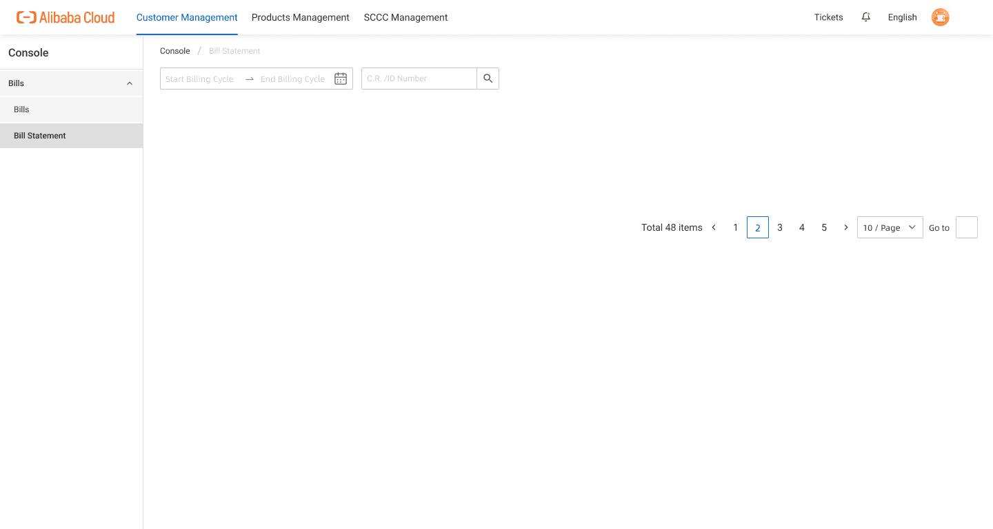
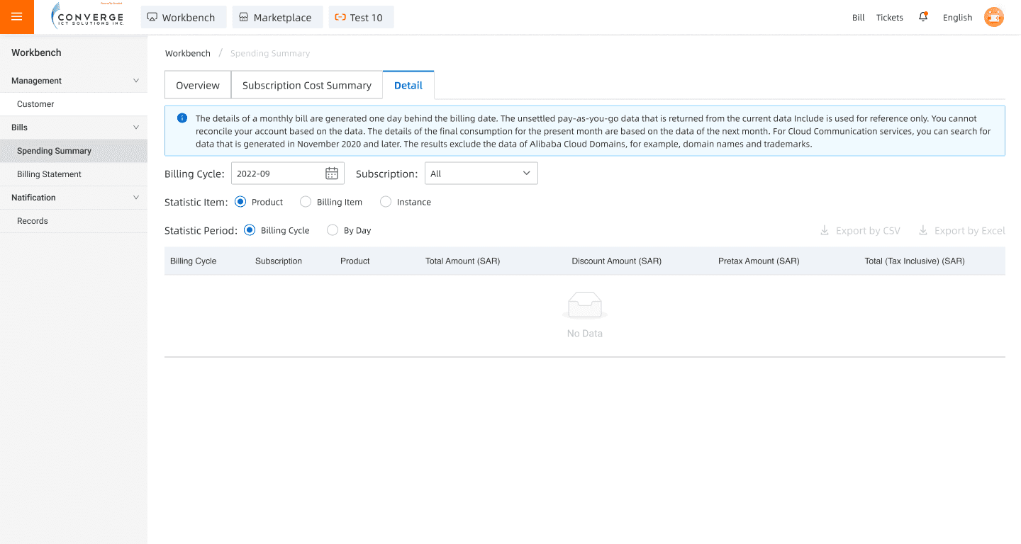
The billing component was primarily split across three pages: Bill statement, Spending summary, and Payment Settings.

Design directions
Introduce an overview page for users who are in to look for quick financial insights.
Incorporate visual components such as charts and graphs for easier comparisons.
Build clearer hierarchy and grouping to make data scannable and digestible.
Lastly, and most importantly, improve transparency with thorough data tables.
Final Designs
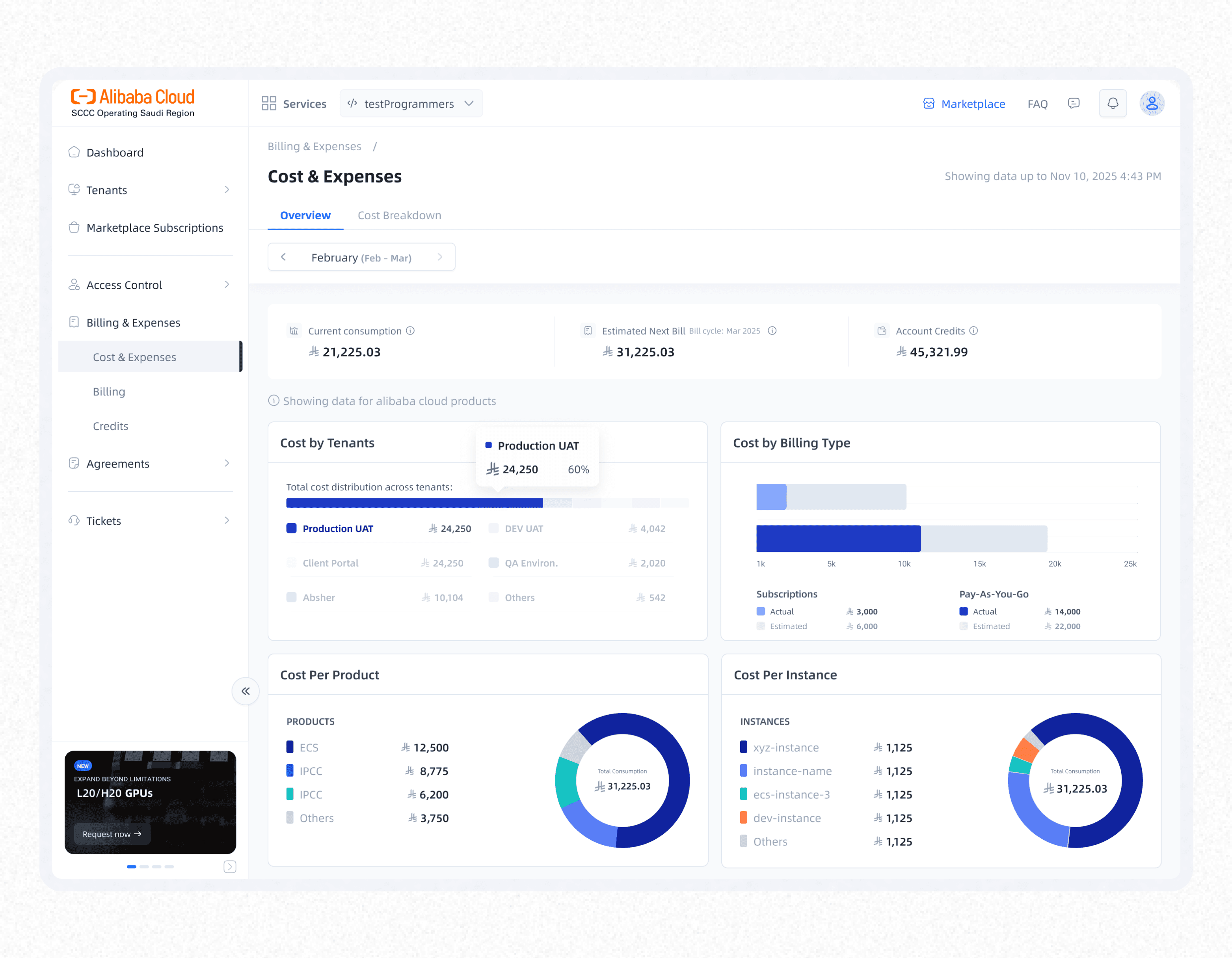
Overview – a page where the user can have a quick look on their current financial situation for better decision making.
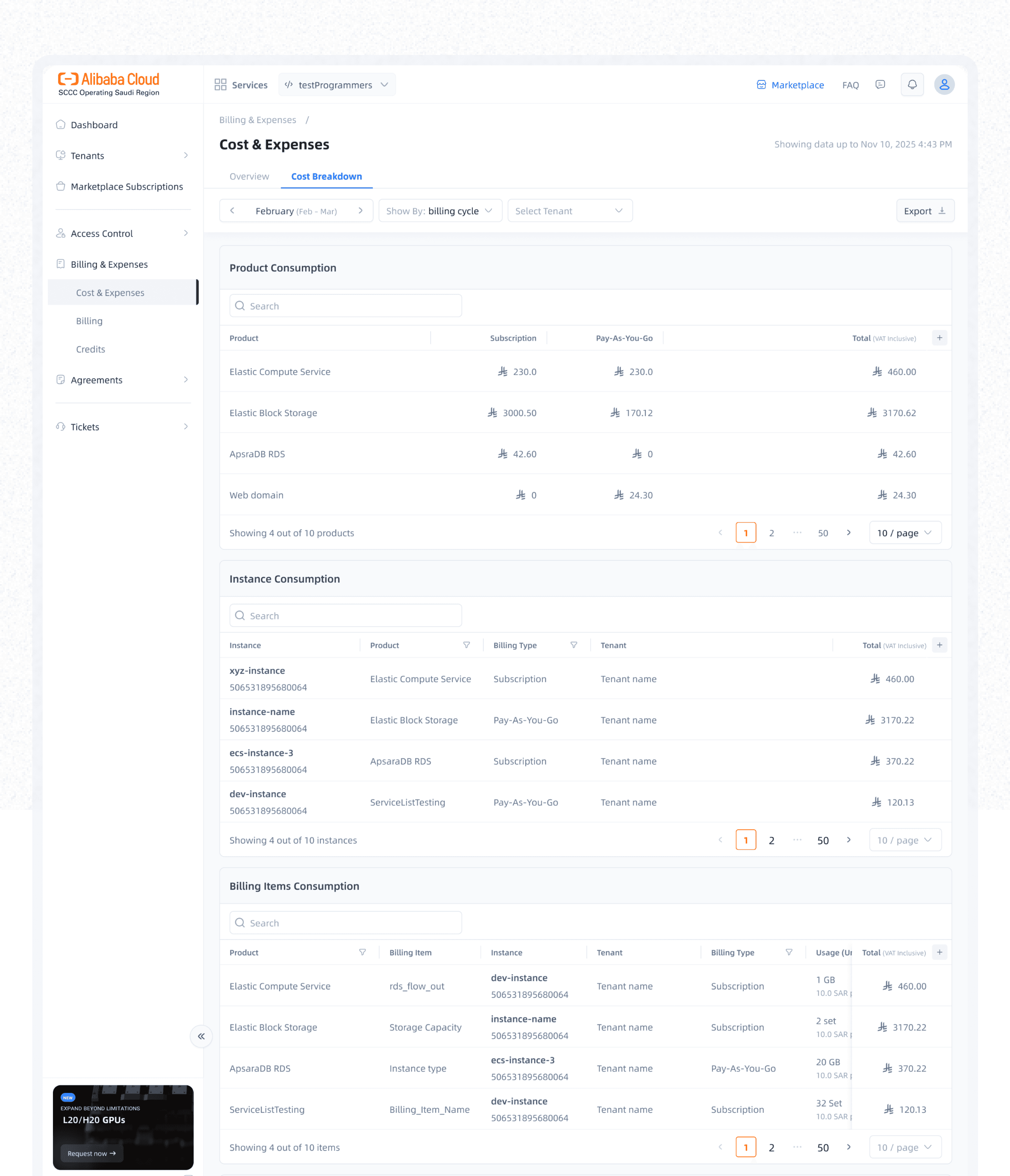
Cost breakdown – this is where all the users who needed more details to get better understanding go to. In-depth analysis of their usage-to-consumption


Tour and feedback – To ensure our users are not confused or lost upon visiting the page for the first time – we added a quick overview tour to guide them through the changes.